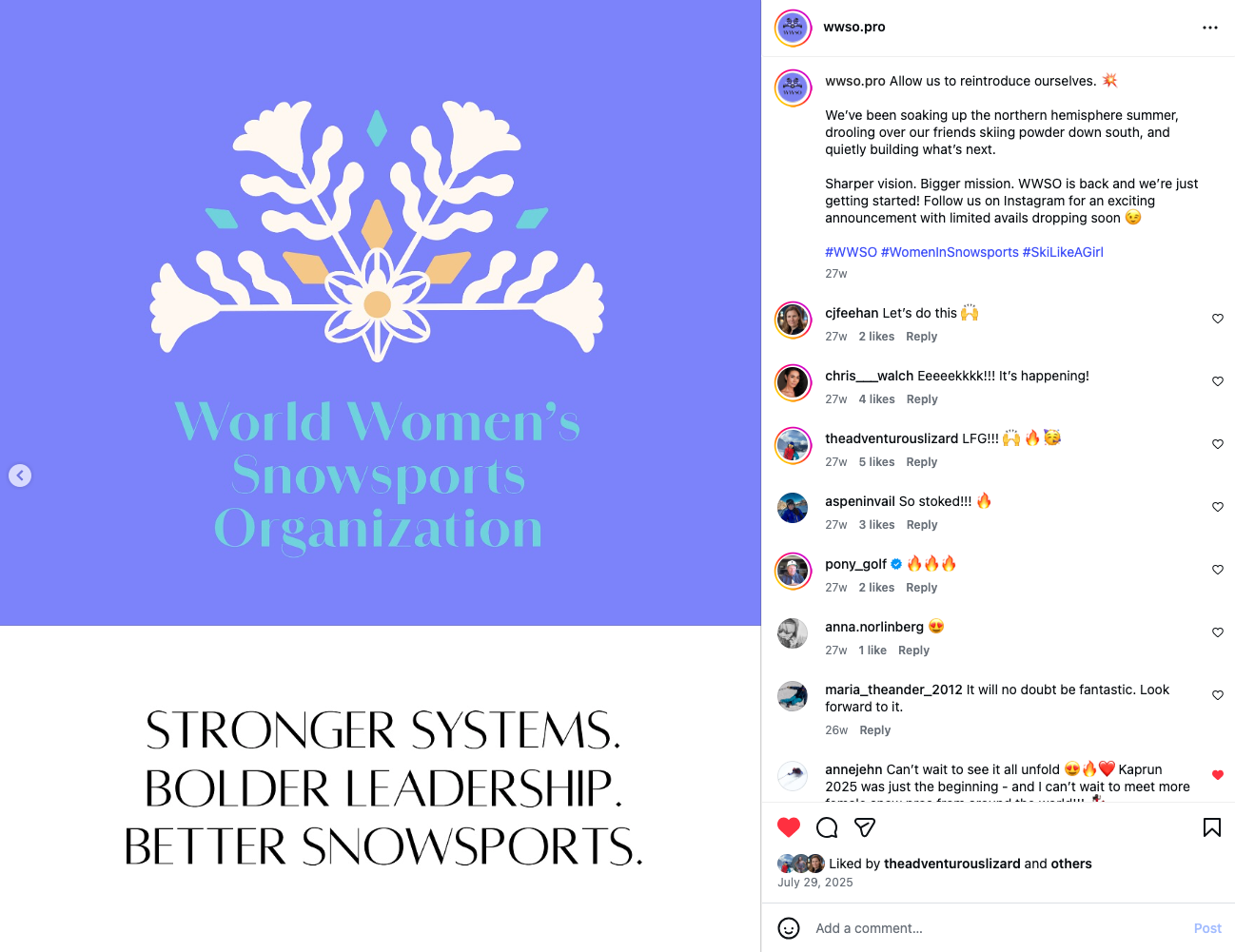
World Women's Snowsports Organization brand design
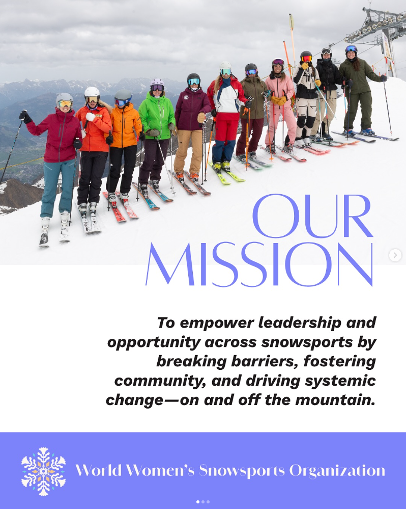
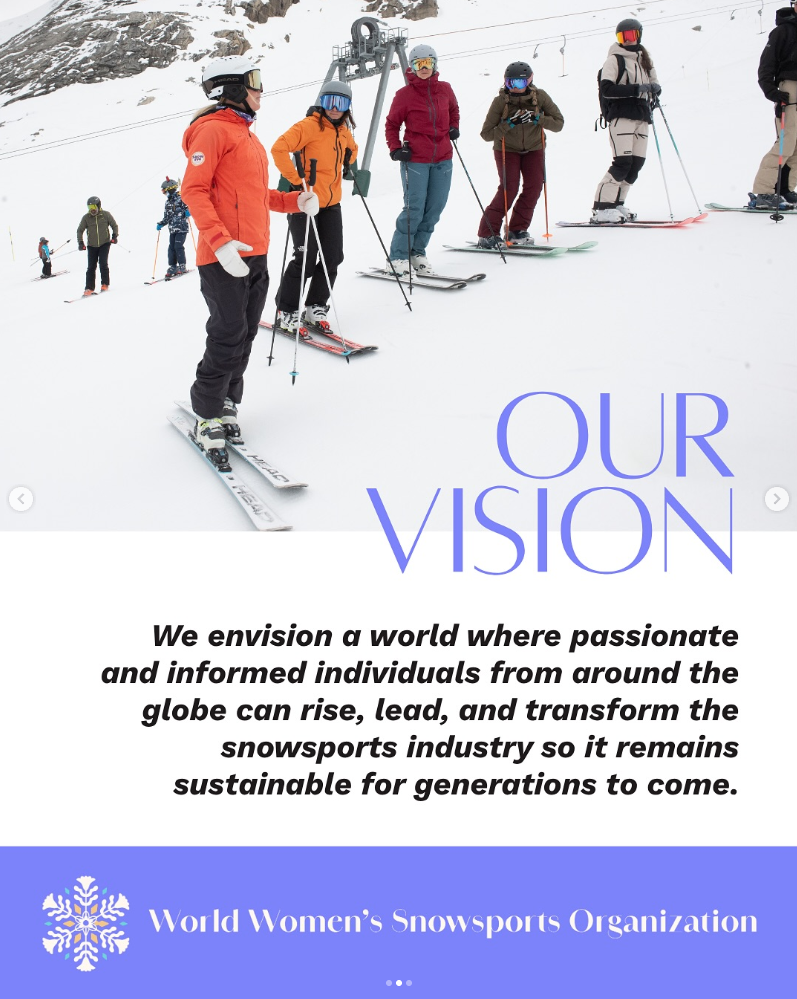
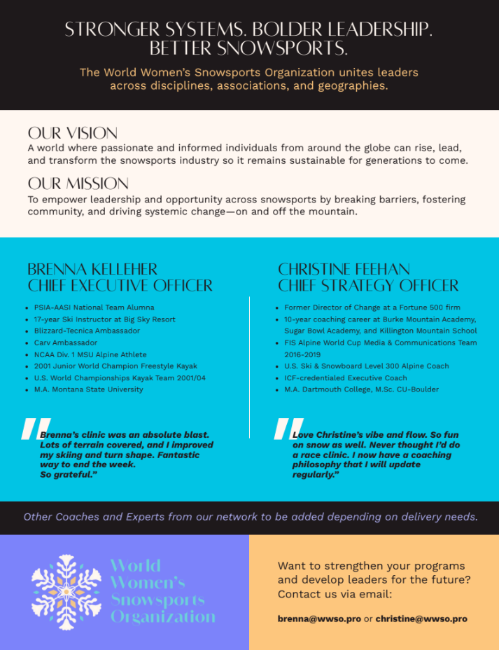
Brenna Kelleher (PSIA/AASI National Alpine Team, Blizzard/Tecnica Athlete, and a Big Sky Resort Guide and Ski Instructor), and Chris Walch (Women of Winter Founder, Big Sky Resort Ski Instructor) reached out to me to join them in founding a social justice start-up, the World Women's Snowsports Organization (WWSO). WWSO empowers leadership and opportunity for women across snowsports by breaking barriers, fostering community, and driving systemic change—on and off the mountain. We envision a world where passionate and informed women from all corners of the globe can rise, lead, and transform the snowsports industry so it remains sustainable for generations to come.
I was tasked with the brand design and developement for WWSO, as well as ongoing creative / brand direction for all WWSO assets and events.
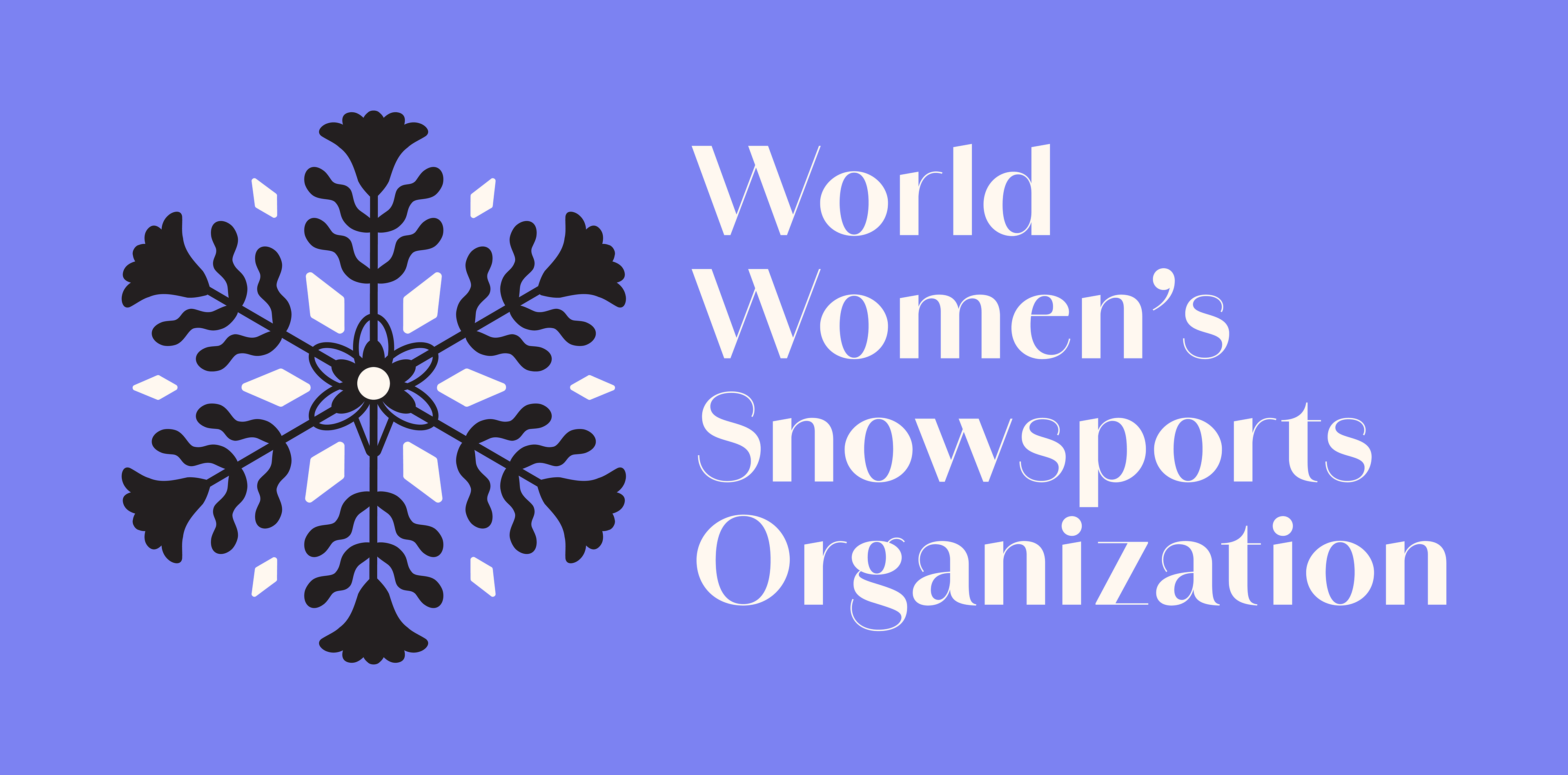
I chose an iconic natural concept for the WWSO brand, instead of going overtly feminine. There is a sizable percentage of women in the outdoor industry who do not fall into the femme category, so I wanted bring forward a more inclusive brand design that really drives home the concepts of snow, mountains, and uniqueness. Women from all different backgrounds and snowsports will be gathered together at our annual summit to connect over their love of the mountains, and I want to them to feel as though they are all represented and celebrated with this brand.
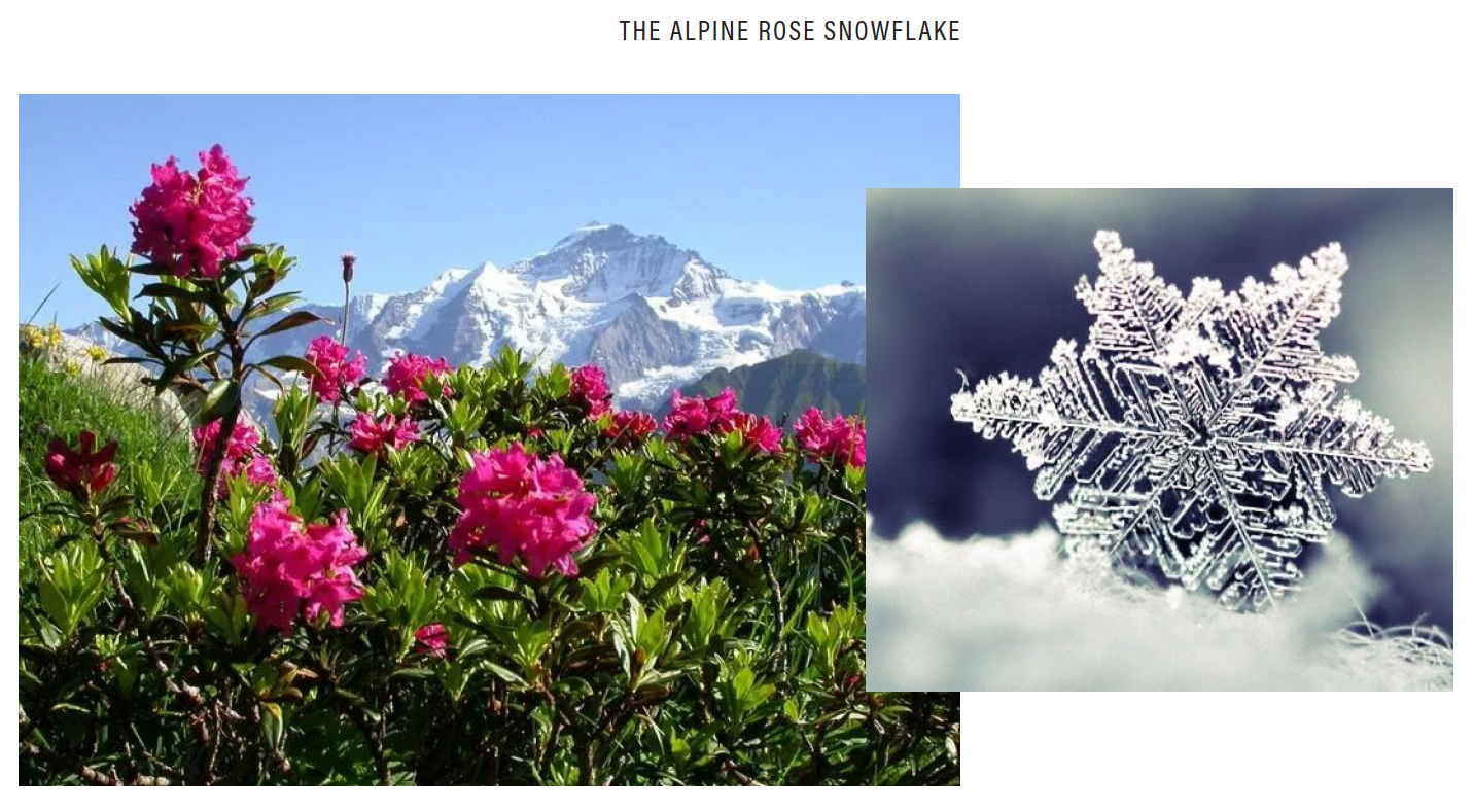
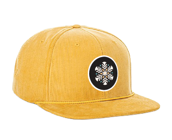
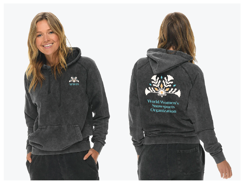
I envisioned a combination of two natural elements - the Alpine Rose and the Snowflake - to symbolize the brand.
The Alpine Rose is the iconic and underrated jewel of the Austrian alps. This resilient pioneer species is covered by a protective blanket of snow during winter. A hearty snowpack is essential for her survival, as she needs deep snow for growth and protection from frigid winter temps. So with the Alpine Rose, you have a flower that hates a low snowpack, only thrives in a thick blanket of powder, and summers with unseasonably hot temps are her worst enemy. I think a lot of women who love the mountains and snowsports can completely relate.
The snowflake is the protector of the Alpine Rose. It is complex, multifaceted, feminine and uniquely individualistic. Singularly they are ephemeral and light, but together they are powerful enough to shut down cities. Snowflakes bring out a sense of wonder, joy and fun, while adjusting to their surroundings with ease. Overall, the snowflake represents the beautiful uniqueness of all women across snowsports, and encourages strength in numbers and connection. They bring out the fun and wonder of the mountains and create a feeling of balance and grace in high alpine elevations.
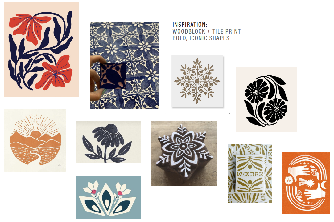
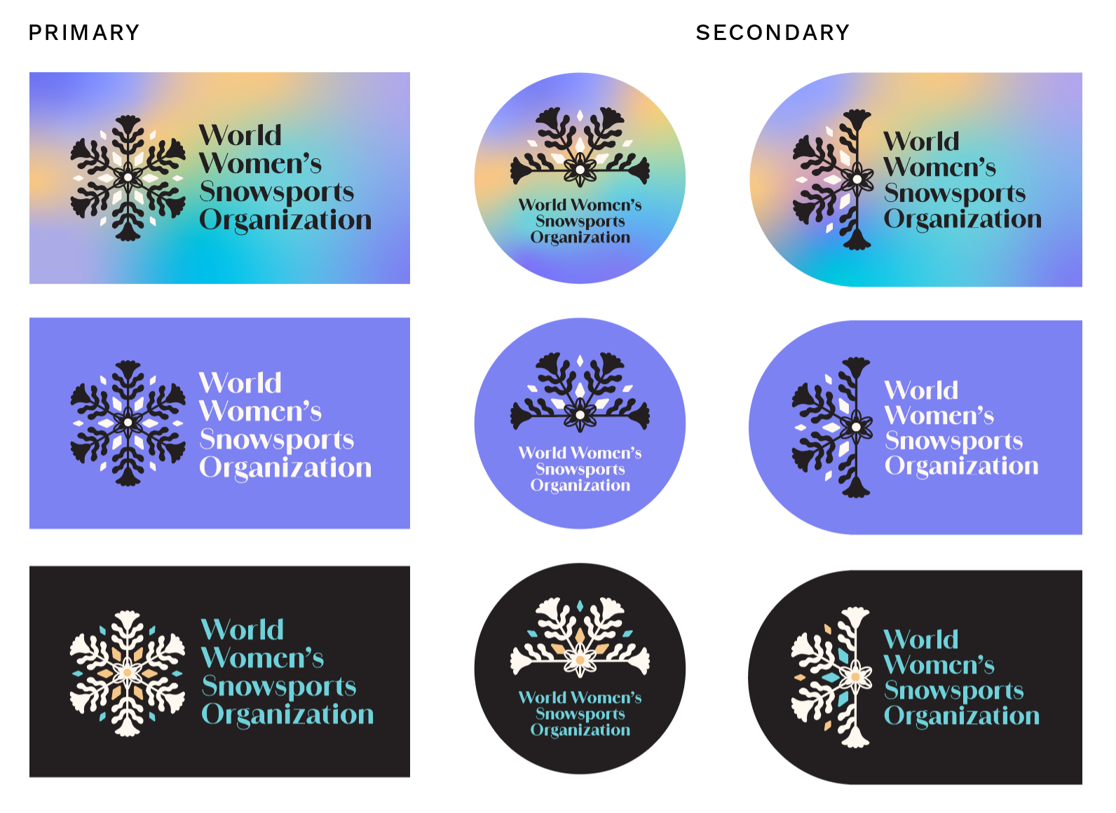
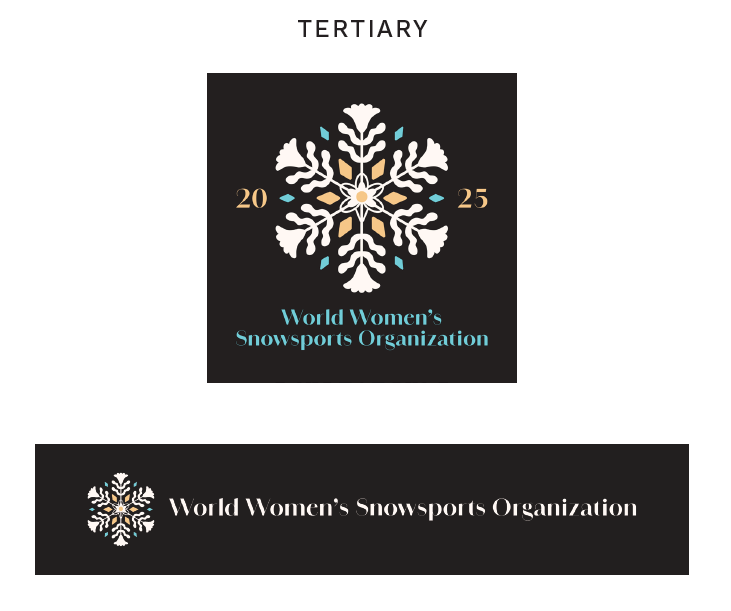
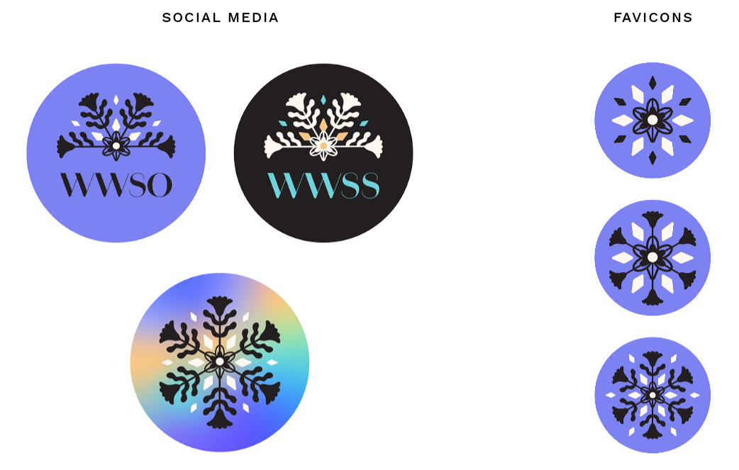
For the logomark design, I drew inspiration from Austrian folk art and embroidery. I created the logomark with thicker linework and filled-in shapes so the design is not lost when printed at smaller sizes. The snowflake arms are built with the shape of a blooming Alpine Rose. The vibrating leaves are celebrating an epic powder day. An Alpine Rose bloom is also centered, opening its 5 cone-shaped petals towards the viewer. The stems from the snowflake arms create natural faceting on the front facing Alpine Rose. This mimics the 3D/crystalized look we see within an actual snowflake.
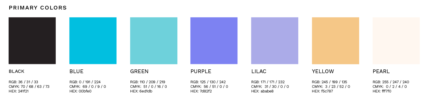
The brand color palette was sampled directly from the snowflake inspiration images. This wide palette gives you a ton of color combo options, without being to overtly femme. The typeface used withinthe logo, Amandine, was chosen by Chris to represent bold femininity.
R O L E
Brand / Creative Director