saltbox granola
brand design
brand design
My client's new venture into small batch hand-made granola was a true labor of love, as each batch was made by hand in her own kitchen, using her grandmothers cookware.
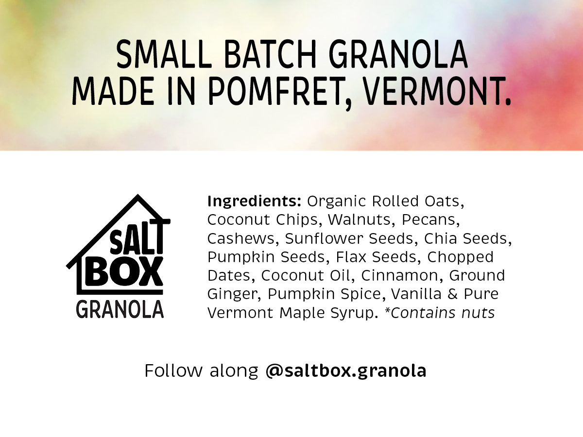
Her goal was to create a brand design that symbolized the house in which the granola was made, and to develop a logo and color palette for Saltbox Granola to be used across packaging and digital applications. She also wanted an ingredients label to use on the back of the packaging. The granola was to be sold at the Pomfret, Vermont Farmer's market.
Her goal was to create a brand design that symbolized the house in which the granola was made, and to develop a logo and color palette for Saltbox Granola to be used across packaging and digital applications. She also wanted an ingredients label to use on the back of the packaging. The granola was to be sold at the Pomfret, Vermont Farmer's market.
Her home is set in rural Vermont and was built in the traditional Dutch Saltbox architecture style. I was inspired by the shape of her home, with it's natural T shape created within the eves of the exterior Saltbox construction.
My client requested that brand colors should taken from an image taken during a recent Dolomites trip where she fell in love with the refugios and massive mountains in Northern Italy. I used these brand colors to create a fun, custom watercolor label for the packaging. We decided on Kraft paper packaging to match the warm, earthy tones of her color palette. A cellophane window in the packaging lets the potential buyer see the delicious granola.
It is truly the best granola I've ever eaten.
R O L E
Brand design concept and creation
logo option sketches
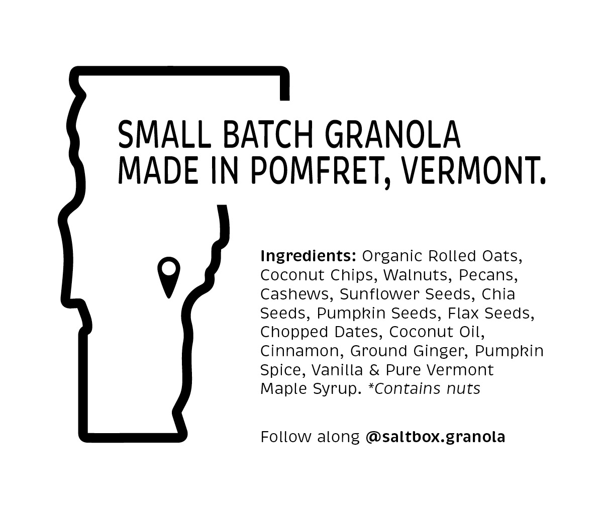
ingredient label options


